Our users’ primary job function is not to become experts in an esoteric and hard-to-use software platform. Their primary job function is usually to find open acreage, evaluate new opportunities, scout their competition, and, in general, help their companies make the right decisions in a competitive, fast-paced environment. Our software should help them do their jobs better by saving them time and money, not become the job itself.
Oseberg’s interface is the point of communion between our users and our data. It is the critical link without which our users would not be able to make sense of the information we so painstakingly collect, normalize, aggregate, and organize. In fact, for many of our customers, the interface is almost as important as the data behind it. Hence, our second guiding principle: “we couple our data with a unified interface [..] that enables our users’ industry experience.”
And, let me be clear here, “interface” at Oseberg applies to both the “I” in “User Interface” and the “I” in Application Programming Interface (API), and we work to perfect the design and experience with both.
As a Product Manager who has been with Oseberg since the beginning, I am obsessed with making sure our products are as easy to use as our data is accurate (to the peanut gallery out there, that means very easy to use).
Lots of B2B software leaves users feeling like this…
Whereas we reach for reactions like THIS…
Software firms and engineers who habitually deal with complex domain concepts are almost always adept software users themselves. As such, it’s easy for them to put the onus on the user to make the most out of the products they build.
“Sure, you can do what you need to do with our software,” they seem to say, “you just have to know where to look and make sure you’ve read all the training materials.”

To avoid falling into the same mode of thinking, we rely heavily on communicating with our users and working with them to deeply understand their feedback. Then, and most importantly, we convert that feedback quickly into the right product tweaks and additions. We do not hesitate to excise or overhaul something that we thought would work well but didn’t. We strive to have less and less of an ego every day. The more honest the feedback, the more valuable.
It is, in short, NOT about us.
We make decisions every day that cascade through the user experience at all levels. When we think about making even the smallest changes, we must keep in mind the cohesive whole and ask ourselves many questions.
The most important question, however, is simple: does our product do the job it is being hired to do?[i]
At Oseberg, our baseline value proposition is that data exists in the public sphere, but that it is difficult to access. If we are to turn that problem on its head into an opportunity, then the data we collect and present must be easy to access.
Too often, businesspeople make a point that enterprise applications should not be pretty, as if improving the design might somehow make the product less functional or serious. Business, after all, is about the bottom line. Why would oil and gas data software need beautiful transitions? Or an easy to understand interface? The users might struggle to learn it a bit, but it is utilitarian after all, right? If a tool is to be used for work, a typical requirement seems to be that it must not be enjoyed. The data is where the value is, so the interface is not important.
I wholeheartedly disagree.
The interface is what leads you to the beautiful nuggets of data we broadcast to our users. Whether an enterprise user is pulling three years of data across an entire state through Oseberg’s Datastream API or running simple search on Sól, the experience should easily become second nature.
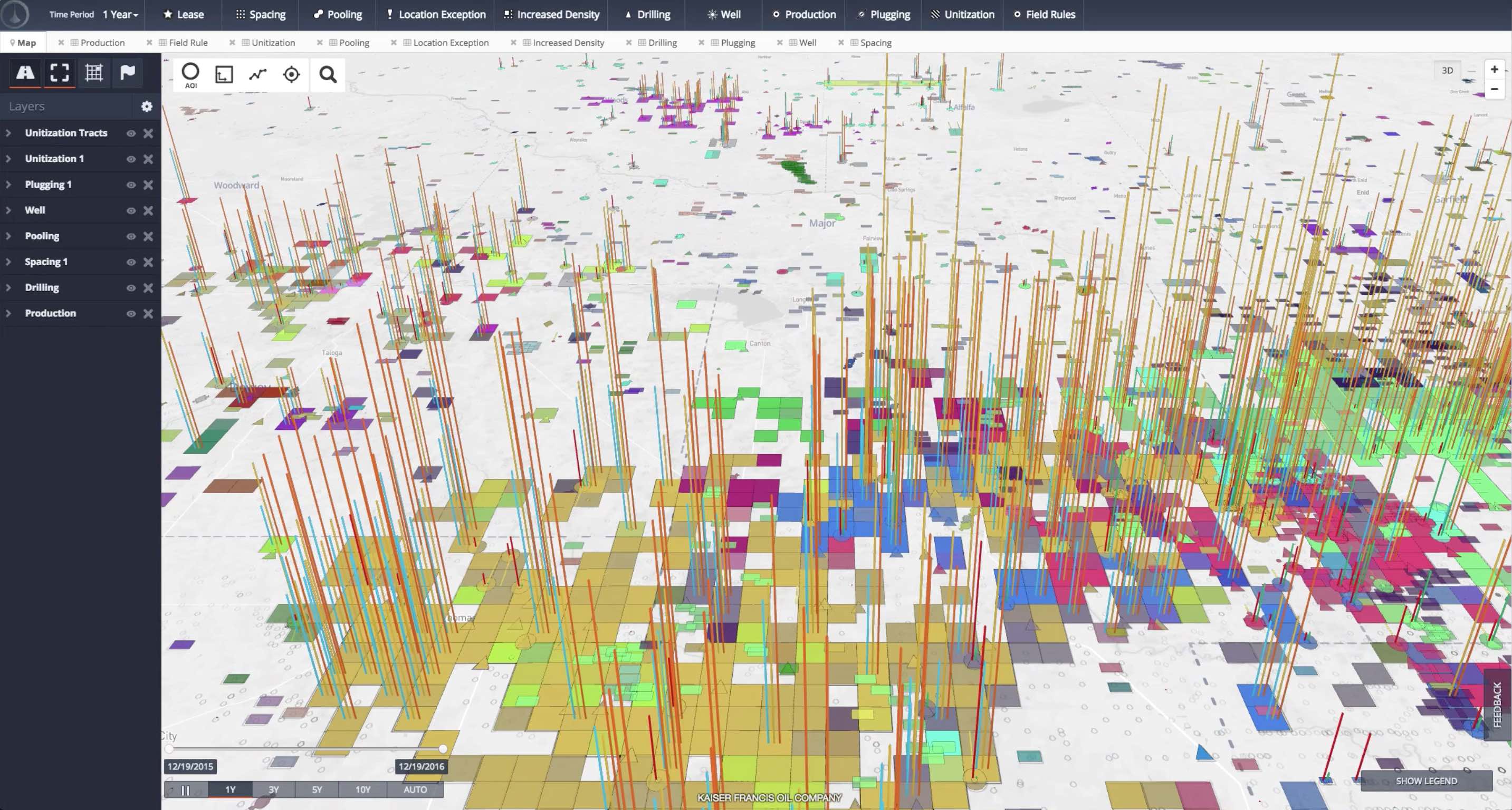
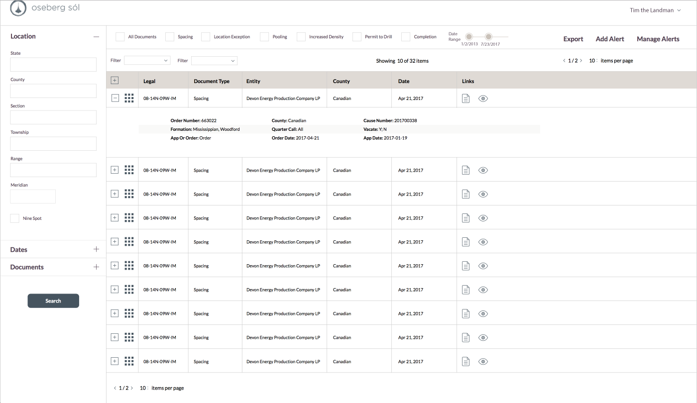
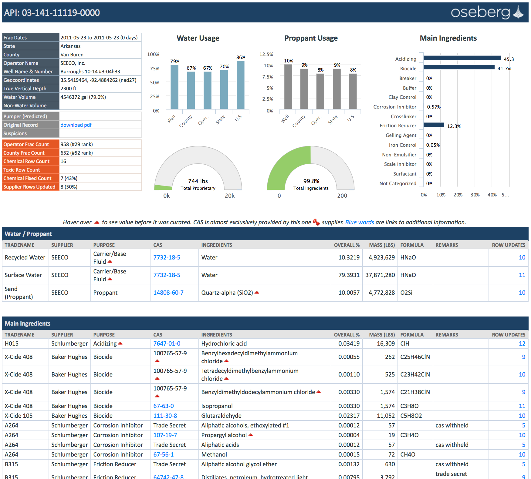
Below you will find screenshots of our two flagship products, Sol & Atla, as well as a sneak peak of a brand new product with only fracking data which we will be releasing soon. Each UI has been lovingly designed to ensure our users can access our data as quickly and intuitively as possible.
Atla

Sol

oseFrac

